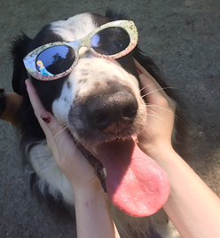
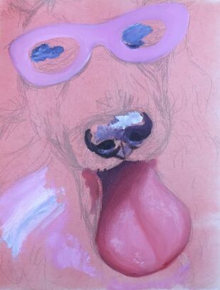
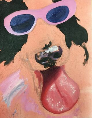
1) My painting is fun and colorful, which is always my main goal when I create a painting. Bright colors and interesting texture definitely took precedence over realism. This piece is semi-realistic, mostly achieved by using a lot of shadows. The color scheme is simple yet effective, and the textures are the most important part of this painting. I spent a lot of time painting the tongue because it was my intention to make it the focal point along with the glasses, which is why I made them very similar colors and textures.
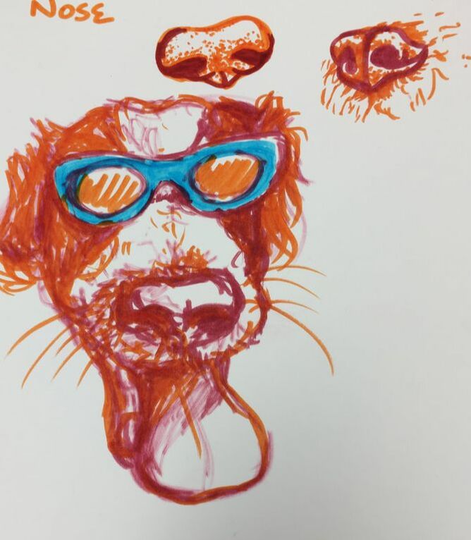
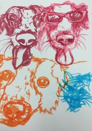
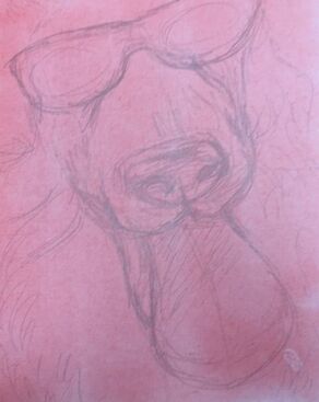
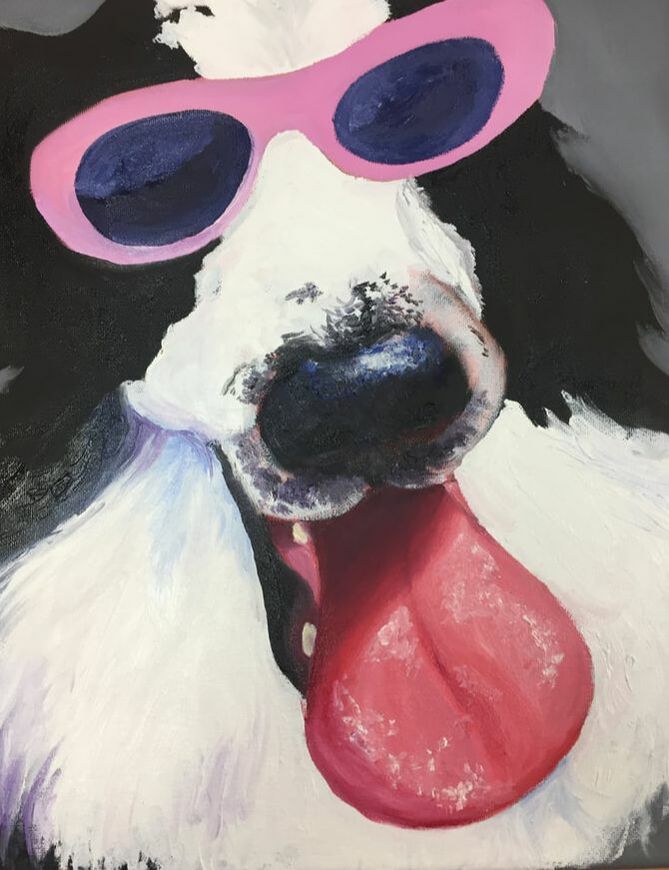
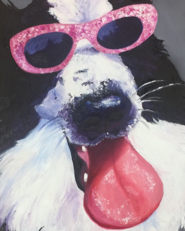
2) My dog is black and white, so creating texture, depth, and realism using different colors was challenging, but forced me to grow. The white fur was given depth by light violets and blues, and the black fur was highlighted with dark violets and blues. The tongue is the most important part of my painting. I wanted to make it realistic and fun in order to evoke emotions and share how cool my puppy is! 3) This piece used a lot of new techniques. I haven't painted an animal in years, and I've never painted one well, so there was a lot of learning to do. First, it was important to work on getting my dog's proportions right. The angle of his head created some challenging situations, but it was helpful that his nose ended up being perfectly centered in the composition that I decided on. Also, texture was a huge component of this piece. Learning to paint hair was very important. The texture of my dog's hair was drastically different from the texture of his tongue and nose, so I had to use lots of different painting techniques, including stippling and blending (but not over-blending!). Because he is a black and white dog, it was difficult to build up shadows and highlights while keeping him a realistic color, but I feel like I did a good job achieving realistic colors that showed his dimension. 4) I learned a lot with this project. My shading skills improved, as well as my use of texture to make a piece more interesting. The progress pictures are really satisfying to look back at because each one is so different and I improved so much as the piece progressed. 5) The craftsmanship of my painting is good. I love the color scheme and subject a lot. I love my dog, so I was very excited to get to paint him, and this is a really funny picture! This is one of my more realistic paintings and it might be my favorite one from this class.
0 Comments
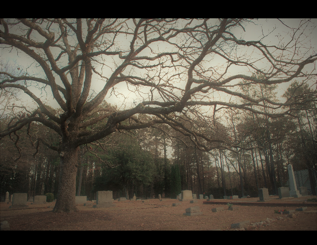
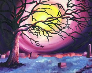
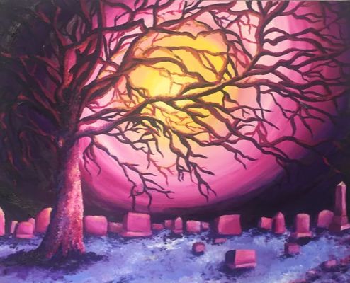 1) My painting is neat, which was somewhat difficult to achieve while still making certain parts textured. The neatness can be attributed to careful planning of the composition of this piece. I think that my craftsmanship perfectly captured how I wanted this scene to feel.
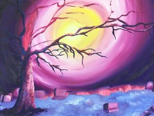
2) As always, color choice was extremely important to me in this work. I used a split-complementary color scheme of red violet, blue violet, and yellow. This creates an eerie and other-worldly effect, as this is not a super common color scheme in nature. 3) I used this scheme to create contrast in my painting, as violet and yellow are complementary colors. The individual pieces of this work also worked to my advantage to create contrast that felt right with the atmosphere of the scene. 4) The contrast was a critical element that I spent a lot of time on, as I used dark violets as shadows and light yellows as highlights. Additionally, there is textural contrast between the smooth headstones and sky and the rough tree and ground. 5) The layers of headstones and void-like sky cause the illusion of depth in this work, aiming to hopefully pull in and intrigue viewers. My goal was to make this piece look 3-dimensional and active, which I think I did a good job achieving, especially through color choice and contrast. 6) The sky and stones were painted using a lot of blending to make them appear smooth, and the tree and ground used stippling with a brush. My original plan was to use a palette knife on this piece, but I preferred the look created by the brush. This was also a great exercise in highlight and shadow placement. 7) Composition was very important in this piece, as I wanted to keep the painting very close to the original reference photo. This meant that the tree had to be placed perfectly so that I would not lose too many headstones and so that the branches would take up a good, natural-looking amount of space. After a lot of trial and error, I finally got the composition exactly how I wanted it. 8) Overall, I feel that this painting was very successful. I'm always especially proud to finish painting something that is based on a picture that I took, as I know that it is 100% original. I love the effect that the background, movement of the branches, stillness of the headstones, and color scheme all come together to create. I'm happy with this piece. 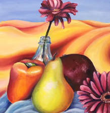 This piece was challenging but really opened my eyes to my love of oil paint. I really enjoyed the vibrancy and quality of the paints, and I think that I did a decent job making sure that this painting was realistic. I love my pear, but I don't like my flowers-- trying to make them look real was exhausting!
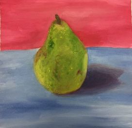
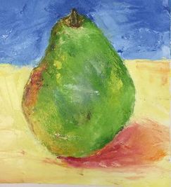
This was my first time using oil paints, and it went decently. First I used a brush, then I used a palette knife for the second painting. I painted a pear that was in front of me. They didn't turn out as well as I would have liked them to.
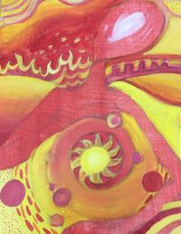
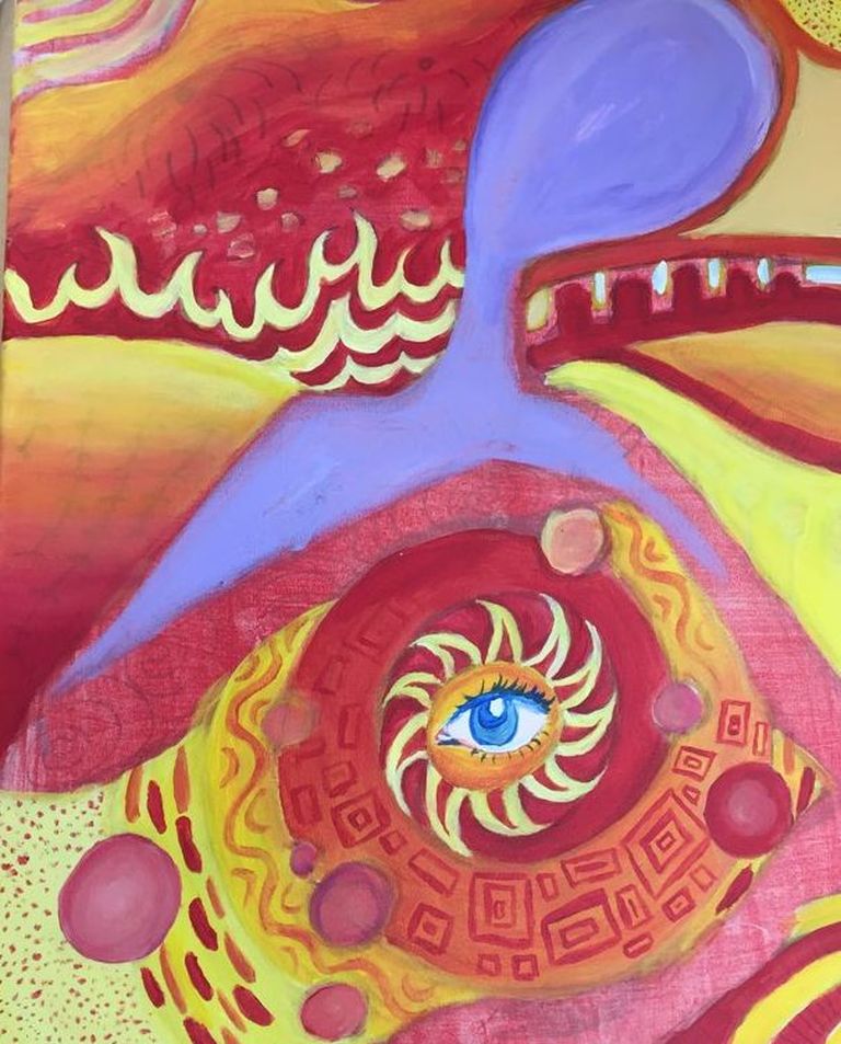
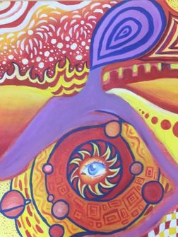
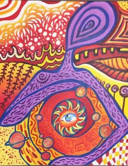
1) My painting is neat and well executed. I think that the design flows nicely and while it is a very busy style of painting, it is not overwhelming. The focal point is the eye, which is light and glittery; the spiral of the solar system also directs your attention towards it. I'm very happy that my idea to make that part stand out the most translated into my final piece.
2) I incorporated many elements of Hundertwasser's work into my project. I used a spiral in my solar system, lollipop trees in the background, and of course an eye. I did my best to make sure that my piece was loose and colorful, which was super fun, and I think that that shows. 3) I experimented with a lot of color schemes before beginning my painting, but ultimately decided on what I think was the best option. The solar system and background are painted entirely in warm colors, mainly yellow and red, while the alien is painted in cool colors. The two main colors in this piece are yellow and purple, which are complementary, and I think that that gives my painting a really nice feel. 4) The focal point of this painting is the eye that is in the sun. There is a spiral leading towards it, and the whites and blues that make it up stand out from the rest of the piece. 5) This project had a lot of emphasis on patterns. I spent a lot of time brainstorming patterns in my sketchbook, which I then used in both the background and the alien's body. Many of these designs were inspired by nature, which you can see in the leaf, vines, and fire patterns. I also used glitter glaze to embellish my artwork, which was super fun! 6) In this painting, the alien serves as a border for the solar system, which draws the eye towards it. It is a sort of unconventional border, but I think that it shows the viewer that the focal point is the solar system. 7) The main color used in my work is yellow, which proved to be a difficult paint to work with. It was very translucent, so I had to paint a layer of white everywhere that I wanted to put yellow. This was frustrating, but easy to fix.
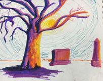
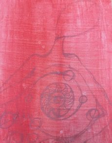
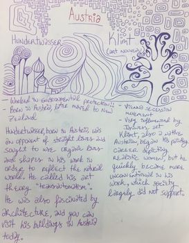
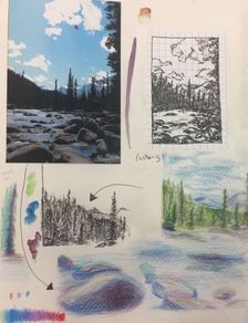
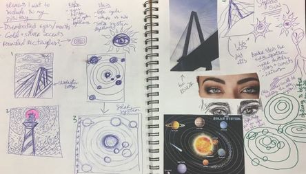 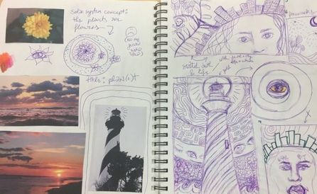 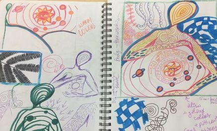 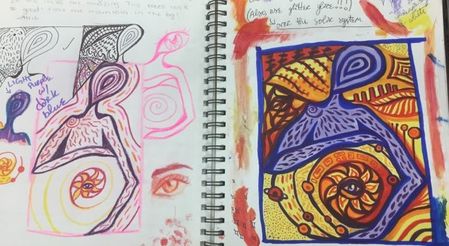 These are all of the sketches that I did in preparation for my Hundertwasser-inspired final piece. I began by researching Hundertwasser and Klimt, two great painters from Austria. I learned about their styles so that I could incorporate them into my plans. I knew immediately that I wanted to have eyes and glitter in my painting! I printed out a lot of reference photos of nature and began to brainstorm. I eventually decided that I would paint an alien holding a solar system, which is an idea that I was really excited to execute.
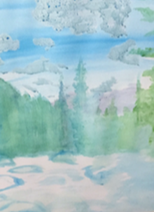
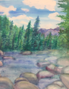
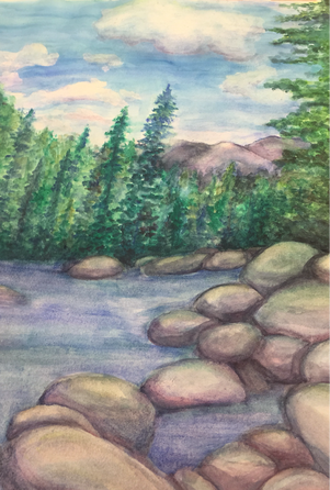
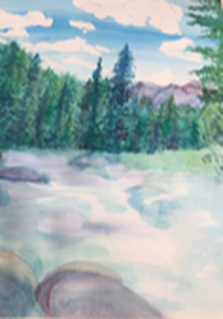
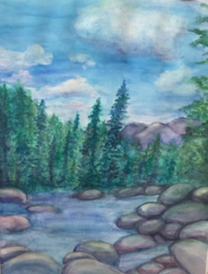
1) In this project I used a lot of different watercolor techniques to achieve the textures that are found in nature. For example, I used masking fluid to preserve the white of the clouds when I painted the sky. I also used the wet on wet technique to paint the mountains, and I blotted in some areas of the water in order to create the illusion of movement. All of these techniques proved effective, although I wasn't a huge fan of the masking fluid; I probably won't use it again. I would, however, use wet on wet again because it made my painting look very soft and pretty.
2) Transparent layers were very important in this project, especially as I built up the texture of the rocks and trees. My first layer of paint was very light and served mainly to block in the areas of color that I wanted in my painting. Then I went in and added colors to make the scene look more natural. There was a lot of experimentation with both color and texture in this piece, as I don't normally paint in watercolor. 3) I think that the composition of my painting is good, but not great. The eye is drawn to the right side of the painting as that is where the largest concentration of rocks is, as well as the large tree that is in the foreground. I planned my painting carefully so that about one third of it would be made up of rocks and water, one third of trees and mountains, and one third of the sky and clouds. As for the rest of the elements of design, I think that they show up well in my painting. The main shapes that are repeated in this piece are circles, which are present in the rocks, clouds, and mountains. 4) Color was, to me, the most important element in this painting. I decided to work from four different colors: ultramarine blue, bright yellow, crimson red, and viridian green. All of these could be combined in different ways to give me all the colors and values needed in my painting. For example, finding a color for the rocks was difficult, as I wanted to stay away from browns and grays. Mixing different amounts of red, yellow, and blue gave me colors that looked natural but retained brightness. 5) I am not a detail-oriented person, so this painting is loose and colorful. I think it is somewhat realistic, although I am not very good at painting realistically. I tried my best to capture all of the beauty of this landscape that I saw in person, and I think that the bright greens and blues portray that well. 6) I like this painting and there's not much I would have done differently. However, I probably should have added more rocks. They were by far the most frustrating component of this piece, so for that reason I did not paint as many rocks as there were in my reference photo. Other than that, I like the simplicity of this piece. 7) I improved a lot in watercolor painting by doing this project. Before, I generally avoided painting in watercolor because it is an unforgiving medium; once you make a mistake, there's no going back! This project helped me to let go of the need for control. It was also an experience that helped me with my color use. In order to get all the textures that I wanted, I had to layer lots of colors, making my painting a lot more saturated and fun than my reference photo! Overall, this has helped and encouraged my artistic advancement. 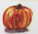 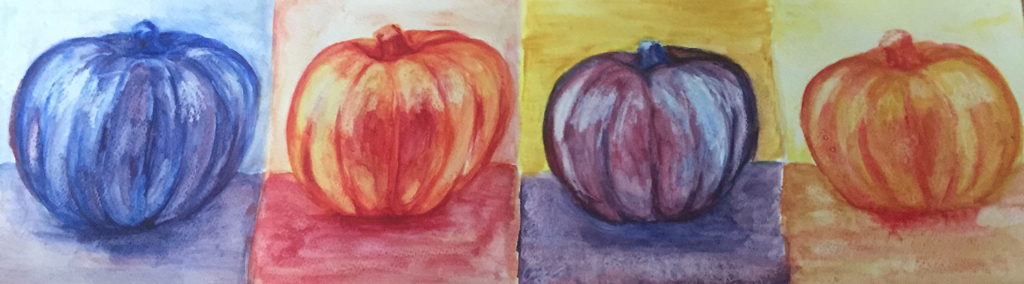 I chose to paint pumpkins to practice using watercolors. First, I painted a pumpkin realistically. Then I used four different color schemes: cool colors, monochromatic, complementary, and warm colors. On all four, I used the resist technique with wax, and on the last pumpkin I also used salt.
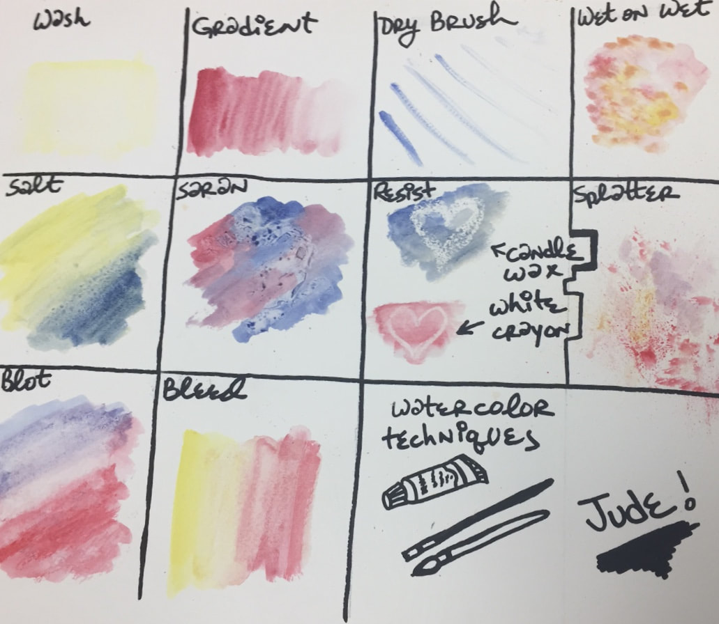 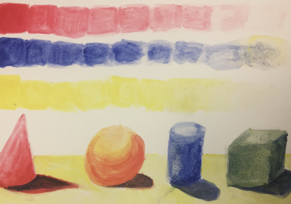 I practiced using watercolors by trying 10 different techniques. Then I painted 4 3-dimensional shapes to practice using different values in watercolor.
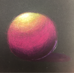
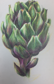
This was my first time using Prismacolors! It was an exercise on blending colors using light layers in preparation for my watercolor project. I really enjoyed this!
|