|
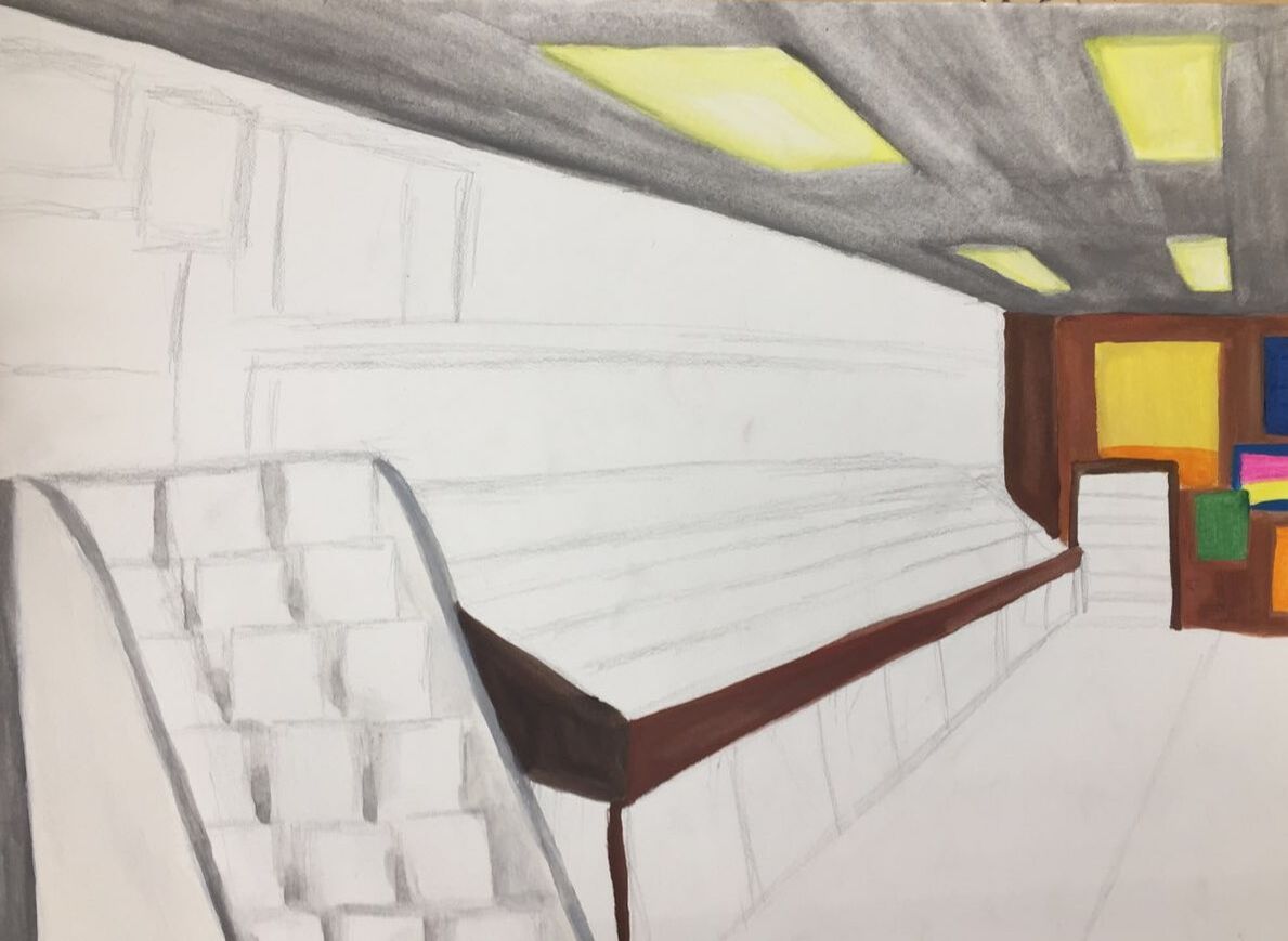
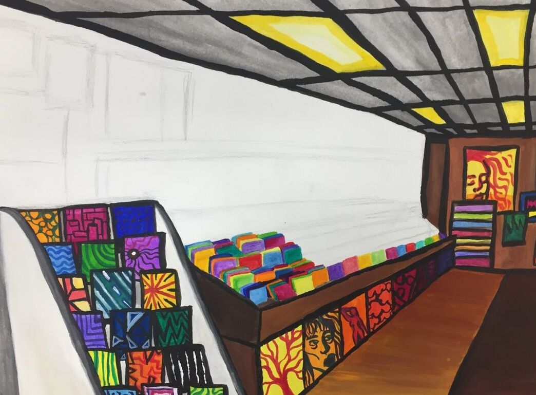
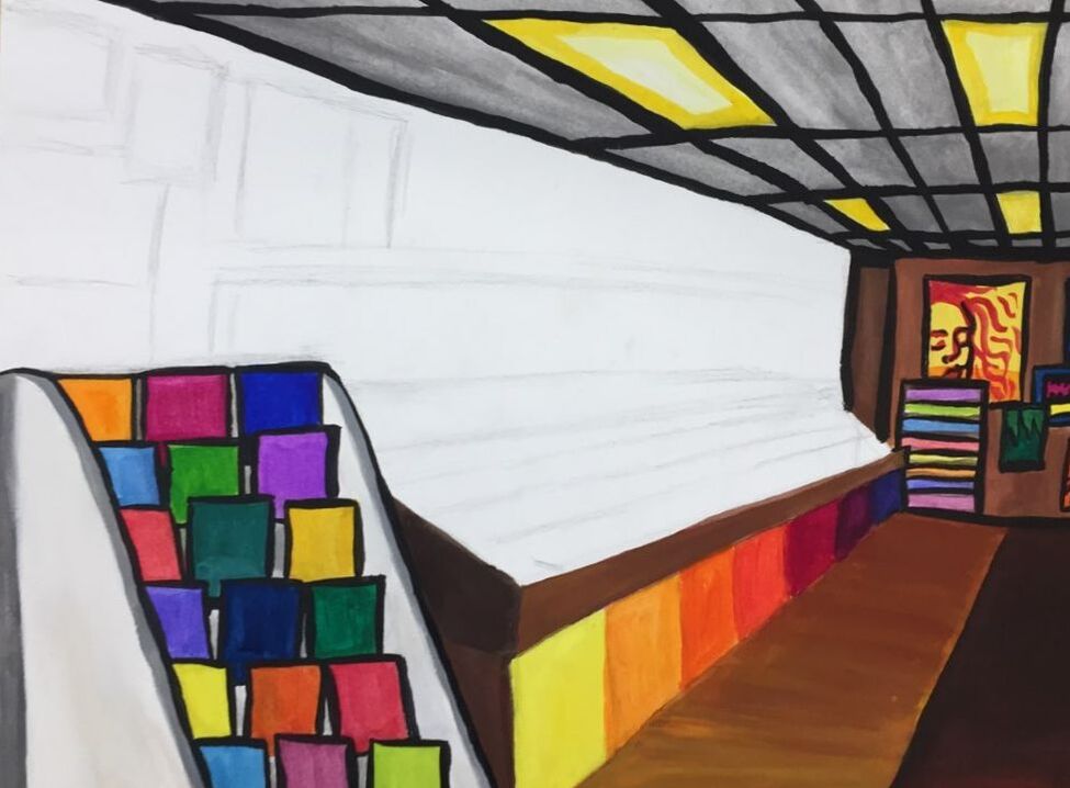
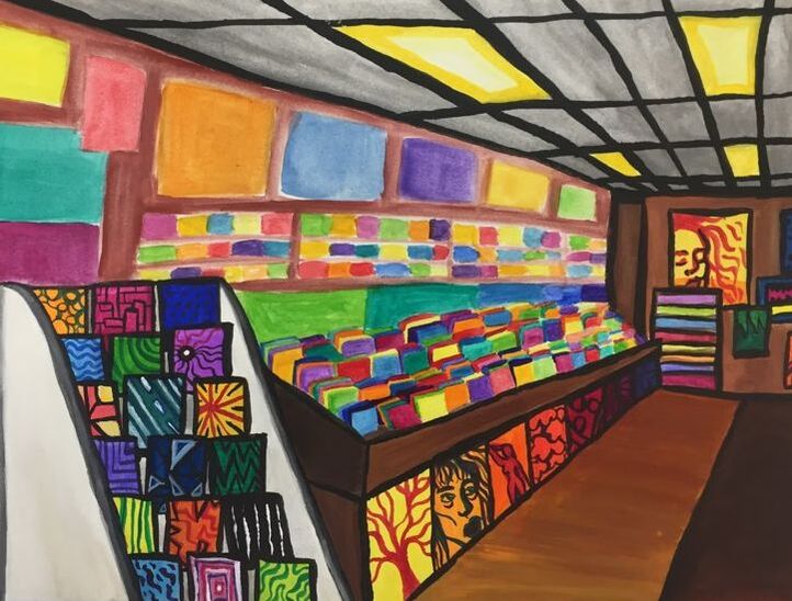
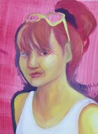
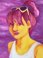
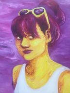
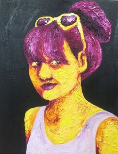
This was the second time that I took painting. This time around, my pieces were more experimental. My self portrait was a study in complementary colors and oil paint texture, both things which I utilize consistently in my work now. My next piece was inspired by Klimt, who is one of my favorite artists. I ended up not liking this piece, which had a lot to do with the bad quality of the acrylic paints that I used. After this, I came up with an alternative project; a gouache painting of one of my favorite record stores. This ended up being one of my favorite pieces of the semester, even though it largely consisted of my gouache and ink experiments. Now I feel somewhat confident in my ability to paint with gouache and ink, which I will use in the future.
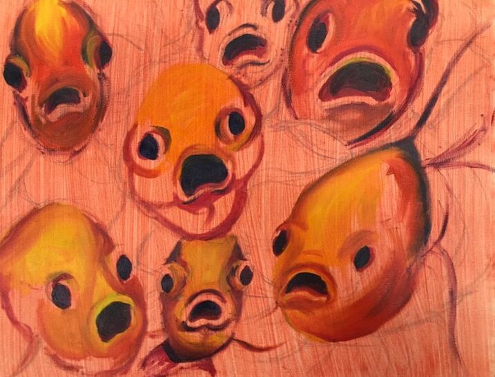
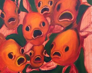
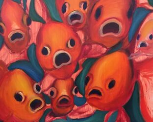
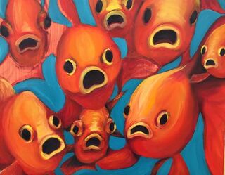
My next painting was my favorite of the year. I painted a group of fish that are looking at the viewer. The complementary color combination of the turquoise background and yellow-orange fish was one that I intend to use in future projects, as I found it really pleasing to look at. This color combination was one of the biggest things that I am taking away from the class. Finally, I painted glass. This was a more technically challenging project for me. It really stretched my ability to paint semi-realistically from observation. This is something that I would do again, but I would be hesitant to paint glass again, as I didn't love the process. Overall, this class helped me learn new media and techniques that I will use in the future in my art.
0 Comments
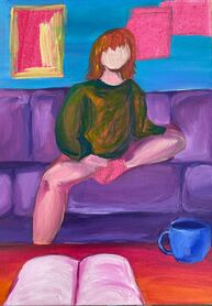
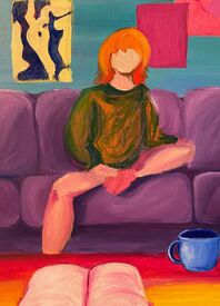
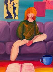
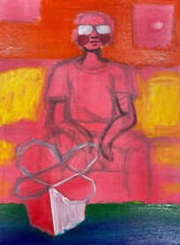
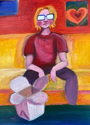
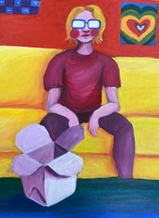
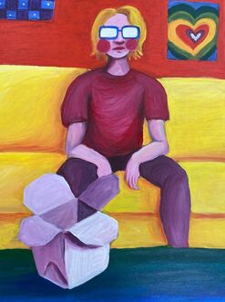
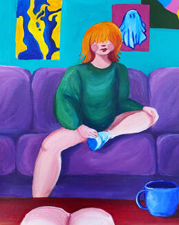
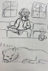
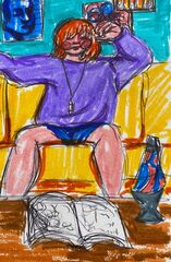
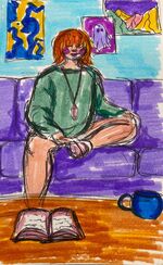
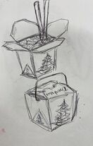
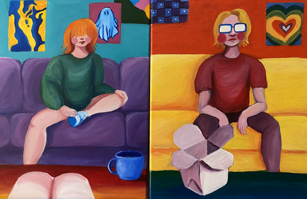 For my final piece, I decided to create two paintings, making a diptych. The first painting is of me with a notebook and mug positioned in the foreground. The second is of my boyfriend with a takeout box in front of him. The pieces flow together; the edges of the couches and tables line up, making it seem as if we might be in the same room even though the colors and scenes are different. The colors in the two paintings are inverted, emphasizing the contrast between them. I did all of this in order to showcase the similarities and differences between me and my boyfriend. It gives the feeling of “together but apart”. I had some trouble with the translucency of the acrylic paint that I used, especially the yellows in the second painting. The thinness of the paint was frustrating, and I had to layer colors many times. Once I overcame this roadblock, however, i ended up liking the way that the two pieces looked, especially when put together.
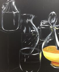
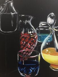
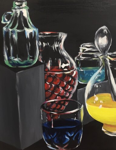 For this piece, I first painted a 16x20 canvas black with acrylic paint in order to have a dark base. I then lightly sketched out a composition based on a still life that was arranged in front of me. I layered light colors over dark ones, starting with the yellow liquid on the right. The yellow liquid was hard to paint because yellow paint is naturally less opaque than most other colors. I tried to paint from life as much as possible. I enjoyed layering whites and letting the black background show through; it was a technique that taught me a lot about negative space and the importance of observation. Overall, I grew a lot as an artist and learned how to use bright colors, especially whites, to my advantage when painting reflective surfaces. I liked using a loose, almost impressionistic style, as it gave the painting character and relieved some of the pressure to paint super realistically; as an artist, I am not particularly drawn towards realism.
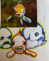
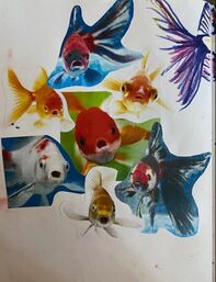
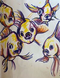
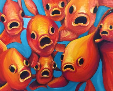 This is my favorite piece that I have created in this class so far! I love the complementary color scheme and whimsical subject matter. Originally, my plan was to paint one fish, but I expanded on that idea and decided to paint multiple fish all looking directly at the viewer. I wanted to create a fun mood and make the viewer feel that they were the one on display! I think that my color scheme is the most important aesthetic quality of this piece, as the turquoise background complements the orange fish and makes them pop out more. When I began painting, the background was much more green, which was not harmonious with the colors of the fish, so changing that green to a brighter blue was one of the best choices I made for this piece. Another choice I made that really improved this painting was deciding to layer bright whites and yellows over the deeper oranges in the fish to make them look textured, shiny, and bright. My layering of colors created a lot of depth that I otherwise could not have achieved.
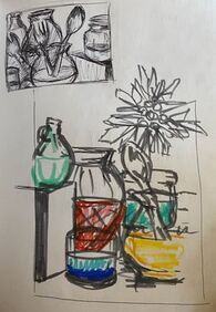
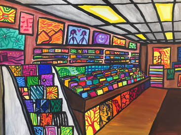 While planning for my interior spaces project for art 4, one of my ideas was to paint a record store. I ended up choosing a different idea for that project, so I decided to paint a record store in painting class! I used gouache and ink, which was challenging because I have never worked with gouache before. I was conflicted over whether to use it more like acrylic or watercolor, and you can see some of that experimentation in my painting. I feel that using ink to outline everything really made this piece pop; I wanted to capture the vibrancy of music in this piece, and I think that I achieved that. This was a fun project; I loved getting to work with different color combinations. I was initially worried that there would be too much brown in the painting, but I think that the neutral colors that are there only serve to balance out the brightness of the records, posters, and CDs.
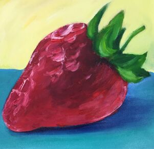
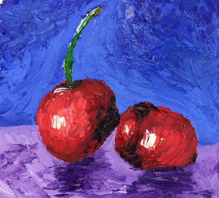
I experimented with oils using reference pictures of fruit. I painted a strawberry with brushes and cherries with a palette knife. I prefer the cherries, as I feel that they have more personality due to the sense of movement that the texture of the palette knife creates.
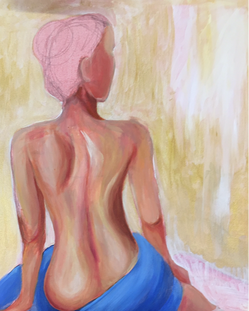
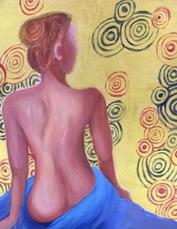
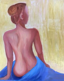
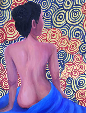 This piece plays with ideas of femininity and self-acceptance. Klimt often portrays nude women, which is something that I was inspired by in this piece. Here, a woman gazes into the distance, which is a gold background full of circles, which are representative of femininity and softness. I decided to paint using primary colors in order to create strong contrast; the warmth of the skin tone contrasts with the coolness of the fabric. The main goal of this piece was to practice figure painting, and I'm happy with how it turned out, as I learned a lot about the structure and proportions of the body, specifically the back. I decided to let my brush strokes show through in order to convey motion to mirror the spirals in the background.
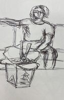
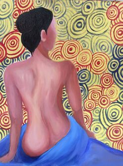
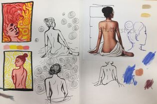
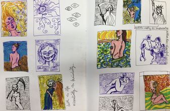
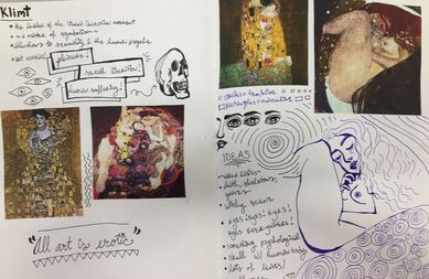 As I had previously done a painting based heavily on the work of Hundertwasser, I decided to research Klimt more thoroughly. He is one of my favorite artists, and I loved learning more about his inspiration and process. I was inspired by his work to create a piece based mainly on a female figure, as that is an overarching theme of his art. Additionally, I wanted to incorporate a lot of gold embellishment. Using these two ideas, I came up with 14 thumbnails of potential paintings, ultimately deciding between an image where a woman with three eyes dissolves into her background and one where a woman's back is featured. I decided on the latter, as I wanted to branch out into figure painting. The woman is looking off into the distance, which is full of circles. Circles, according to Klimt, are representative of femininity, and I wanted to play with the idea of embracing one's own femininity, as that is often something seen as shameful.
|